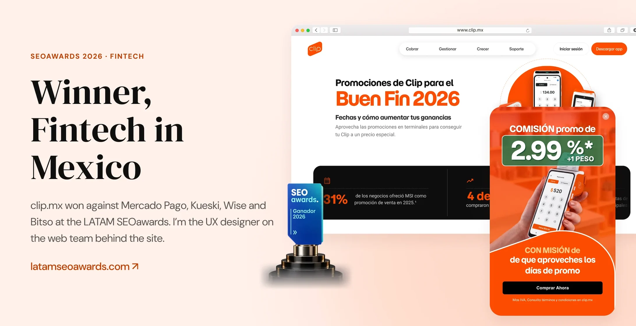
UX and CRO for clip.mx, the website of Mexico’s most valuable fintech brand.
Live
Most of the pages here are on clip.mx today
#1
Most valuable fintech brand in Mexico · Kantar BrandZ 2025
3
Audiences, each with its own path
METHODS
A/B testing · Session recordings Funnel analytics · HTML prototypes
- Problem
- clip.mx has to convert merchants who arrive ready to buy a terminal, while Clip repositions itself as a full financial platform.
- My role
- Product designer on the web team that owns clip.mx. I design the UX, page structure and CRO experiments across the site, working with Brand and Product.
- Impact
- clip.mx won Fintech in Mexico at the SEOawards 2026. I'm the UX designer on the team behind it.
Mexico’s most valuable fintech brand
Clip is Mexico’s most valuable fintech brand, and the only fintech in Kantar BrandZ’s 2025 ranking of the top 30 Mexican brands. It’s known for its card terminals and also offers Tap to Pay, a business account, loans and investing, all sold through clip.mx.
I’ve designed for the site since September 2025, across the whole funnel: the homepage and product pages, checkout, pricing calculators, landing pages for each audience, A/B tests, seasonal campaigns like Buen Fin, and the move to Clip’s new brand. Brand and Product weigh in, and the web team decides how pages are built.
Sell the terminal, show the platform
Most visitors land on product pages already wanting a terminal. At the same time, Clip is repositioning itself as a full financial platform. Every page I work on has to keep the sale easy for the first group without hiding everything else Clip offers.
Small merchants
Want a terminal, and want it fast.
Product and promo pages with pricing up top, cost calculators, then straight to checkout.
Businesses
Need volume pricing and a person to talk to.
A B2B page that qualifies visitors and routes them to the right sales flow.
Resellers
Want to earn money with Clip.
Two clear paths: refer merchants for free, or buy kits to resell.
Design decisions on clip.mx
Reposition the site without losing the sale
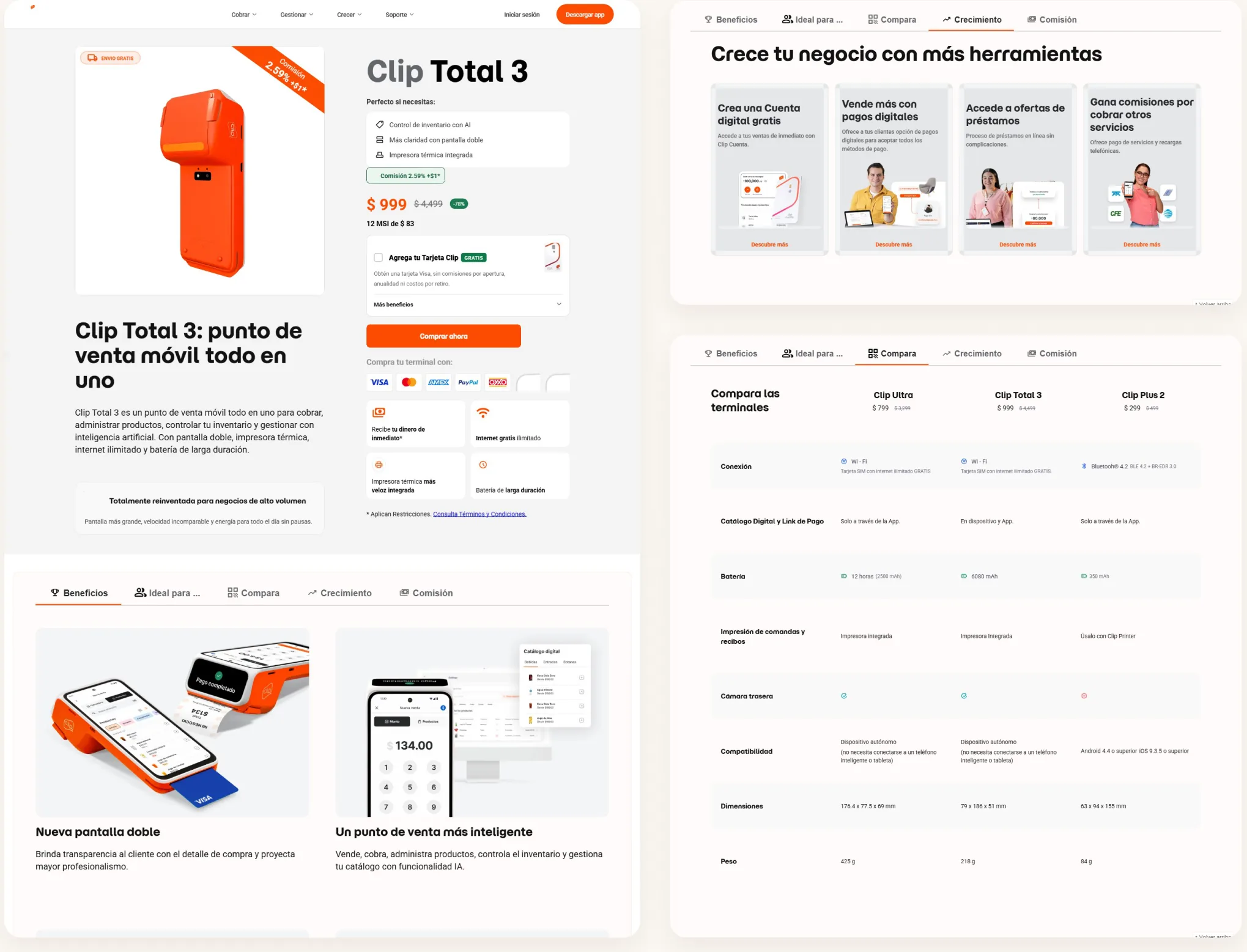
Clip wants to be seen as a full platform, but most traffic still arrives to buy a terminal. I reviewed the new homepage against our three audiences and the business goals, and made the case for keeping the trust signals the live site relied on. On product pages like Clip Total 3, the buy box comes first, and the account, loans and payment tools sit one tab away.
Give each audience its own path
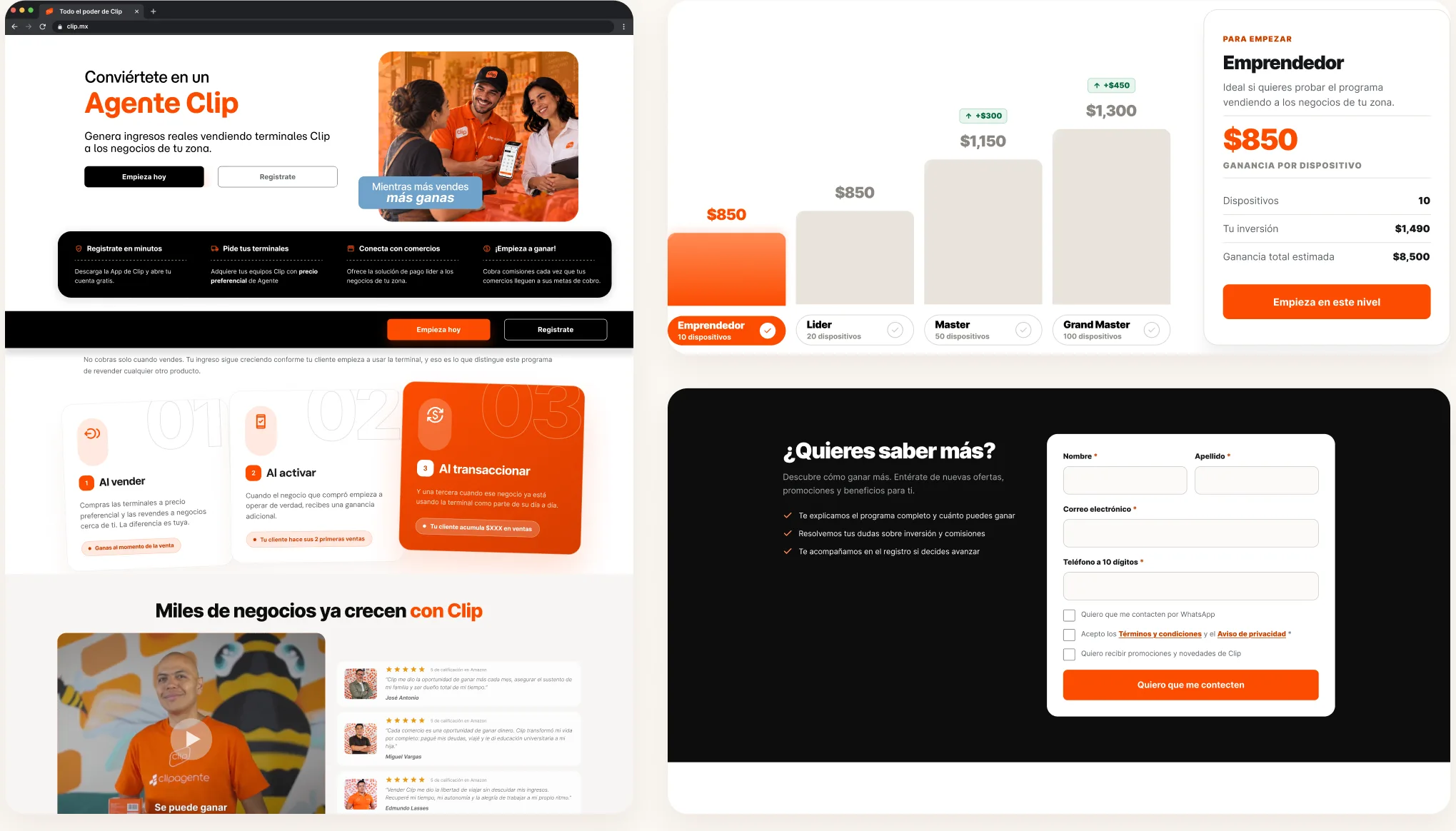
Small merchants, businesses and resellers come to clip.mx for different reasons. The B2B page qualifies visitors and routes them to the right sales flow, and the reseller page separates the free referral path from buying kits. I also explored a recommendation quiz that matches merchants with the right product.
Show the cost before asking for anything
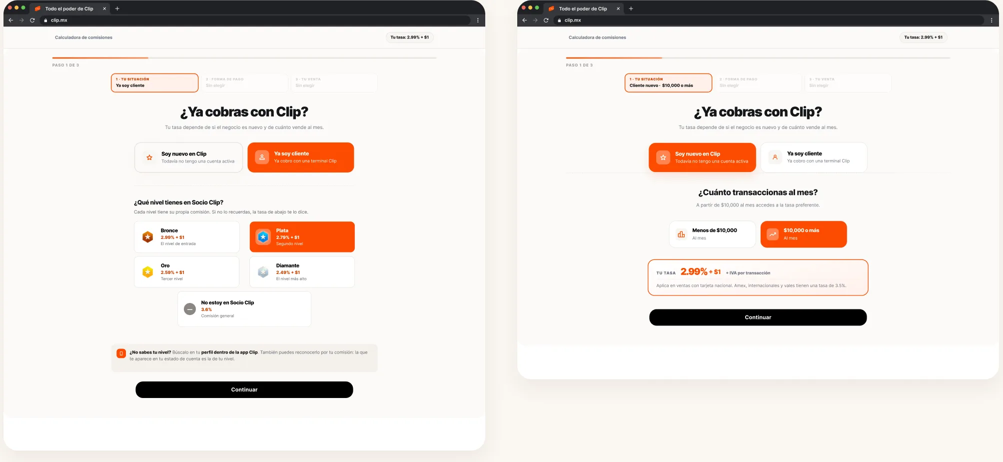
Fees are the first thing a merchant asks about. I designed interactive calculators, including the new tiered commission model, so people can see what they’d pay before signing up. The Bolsitas page follows the same idea, with trust built in before the sign-up form.
Roll out the new brand one page at a time
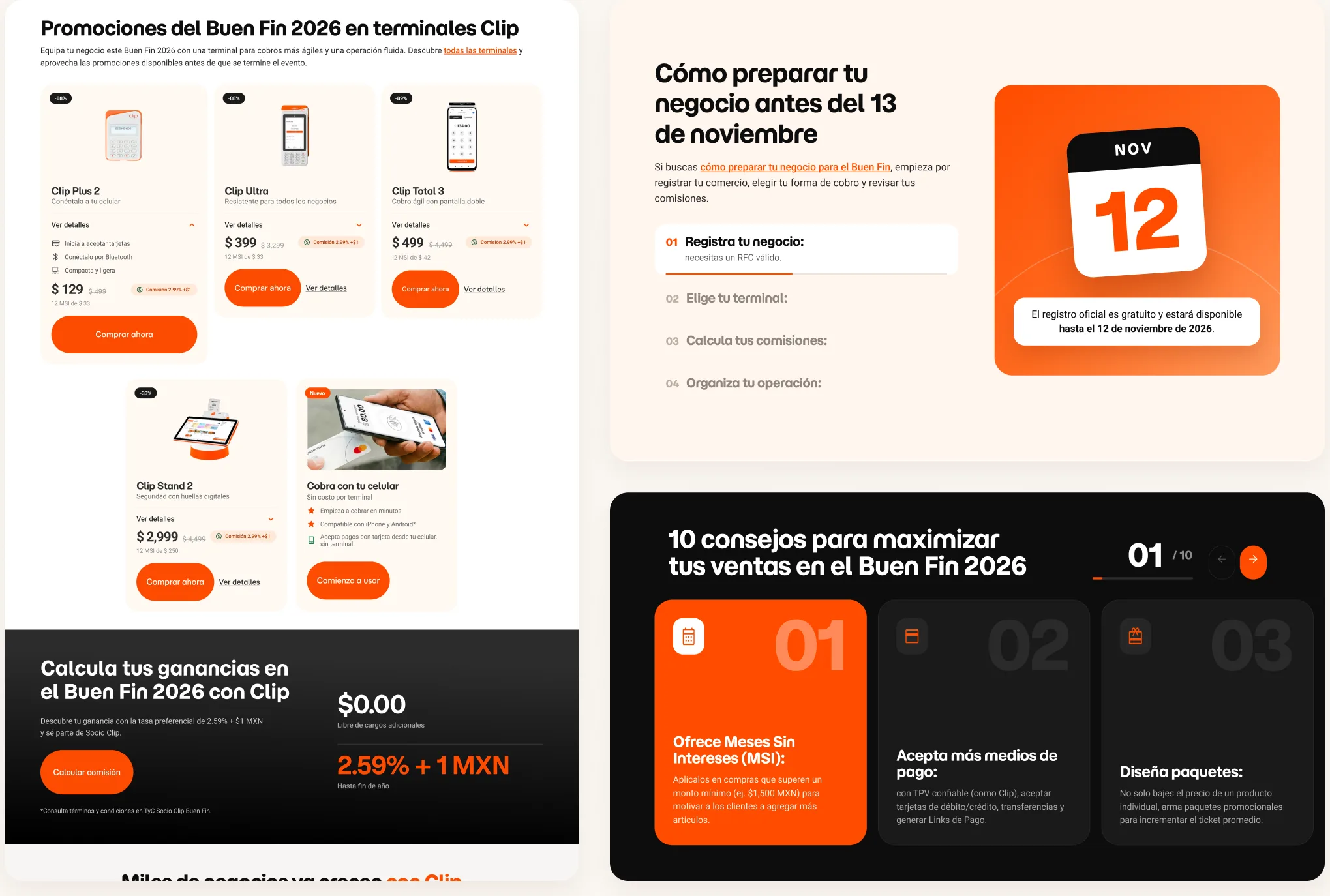
Clip has a new brand book, and the site moves to it page by page while it keeps selling. Buen Fin 2026 is a good example: I reused the modules already built for clip.mx and designed the rest in the new look, from the promo dates and terminal deals to tips for merchants with a source for every market figure.
CRO across the site
I design ongoing experiments for clip.mx, from A/B tests to promo pages, retention pop-ups and conversion banners. Session recordings and funnel data showed most clicks happen near the top, so on high-intent pages pricing and checkout moved above the fold. The bundle test on product pages shaped which devices got the bundle.
Funnel data
Session recordings and funnel analytics decide what moves up the page.
A/B tests
Changes to product pages get tested before they roll out.
Pop-ups
Retention pop-ups and conversion banners across the site.
Campaigns
Terminal promo pages and seasonal moments like Buen Fin.
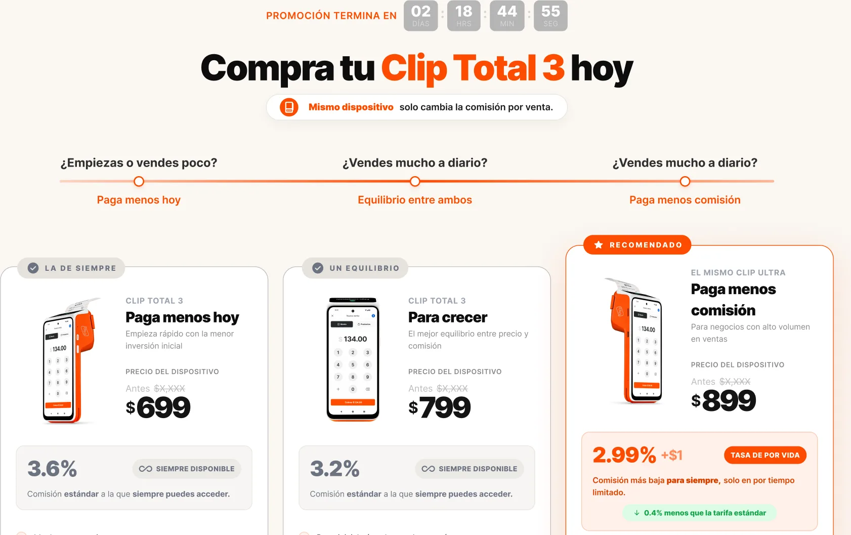
On the Clip Total 3 promo page, merchants choose how to pay for the same device: less up front, or a lower commission on every sale.
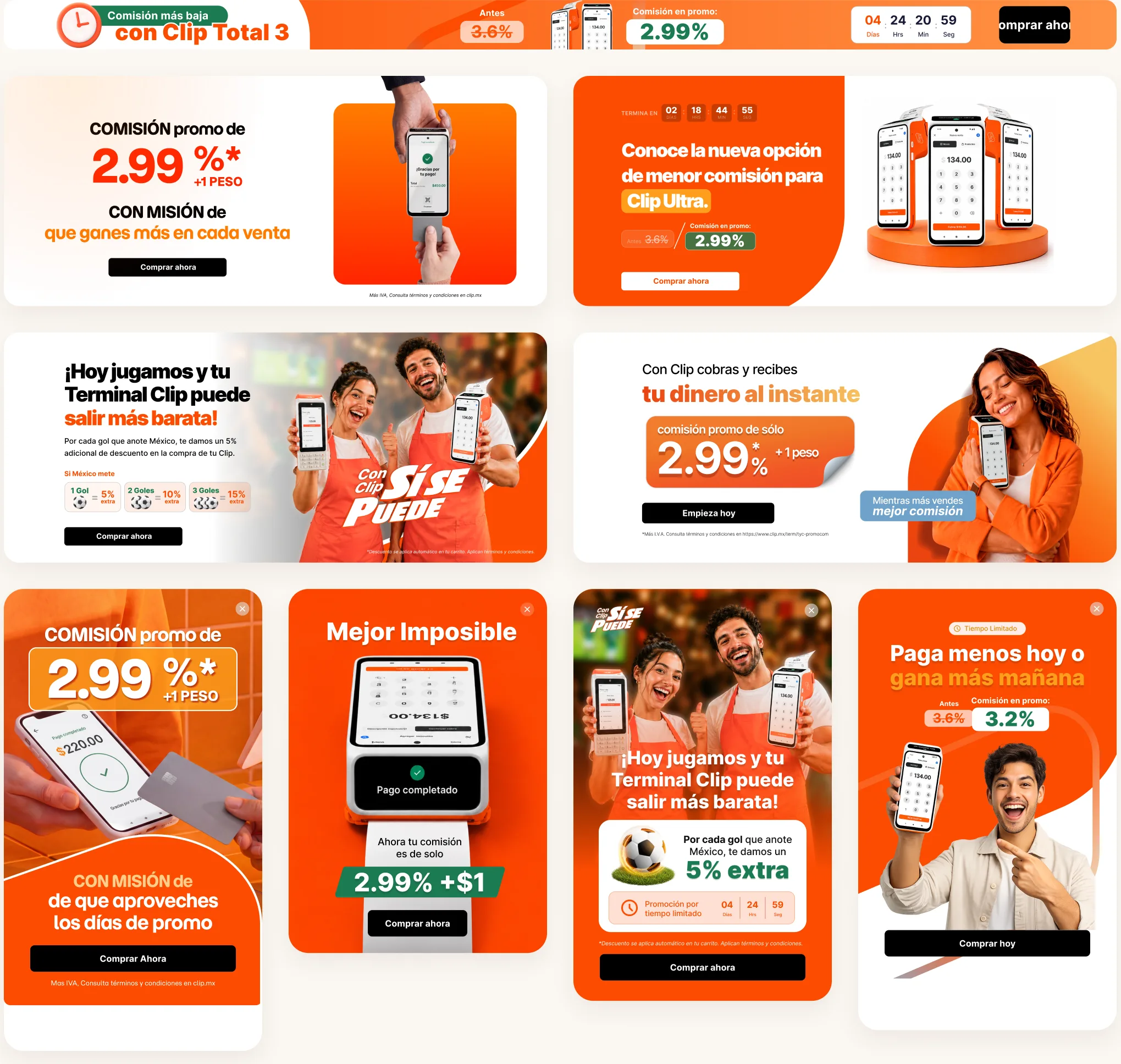
Every campaign runs on the same promo kit: hero banners, mobile pop-ups and an announcement bar, each with the offer, a deadline and one button.
Also on clip.mx
Other pages I designed for the site, most of them live.
Next project